Flutter 中的佈局
概述
#Flutter 佈局機制的核心是元件。在 Flutter 中,幾乎所有東西都是元件——即使佈局模型也是元件。你在 Flutter 應用中看到的圖片、圖示和文字都是元件。但你看不見的東西也是元件,例如用於排列、約束和對齊可見元件的行、列和網格。你透過組合元件來構建更復雜的元件以建立佈局。
概念示例
#在以下示例中,第一個截圖顯示了帶有標籤的三個圖示,第二個截圖包括行和列的視覺佈局。在第二個截圖,debugPaintSizeEnabled 被設定為 true,這樣你就可以看到視覺佈局。


這是上一個示例的元件樹圖
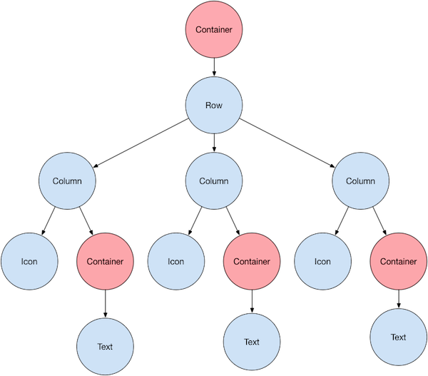
大部分內容應該如你所預料,但你可能對容器(顯示為粉色)感到疑惑。Container 是一個元件類,允許你自定義其子元件。當你想新增內邊距、外邊距、邊框或背景顏色等功能時,可以使用 Container。
每個 Text 元件都放置在一個 Container 中以新增外邊距。整個 Row 也放置在一個 Container 中以在行周圍新增內邊距。
使用者介面的其餘部分由屬性控制。使用 Icon 的 color 屬性設定其顏色。使用 Text.style 屬性設定字型、其顏色、粗細等。列和行具有允許你指定其子項垂直或水平對齊方式以及子項應占用多少空間的屬性。
佈局單個元件
#如何在 Flutter 中佈局單個元件?本節向你展示如何建立和顯示一個簡單元件。它還展示了一個簡單的 Hello World 應用的完整程式碼。
在 Flutter 中,只需幾個步驟即可在螢幕上放置文字、圖示或影像。
1. 選擇一個佈局元件
#根據你希望如何對齊或約束可見元件,從各種佈局元件中進行選擇,因為這些特性通常會傳遞給包含的元件。
例如,你可以使用 Center 佈局元件將可見元件水平和垂直居中
Center(
  // Content to be centered here.
)
2. 建立一個可見元件
#為你的應用選擇一個可見元件,以包含可見元素,例如文字、影像或圖示。
例如,你可以使用 Text 元件顯示一些文字
Text('Hello World')3. 將可見元件新增到佈局元件
#所有佈局元件都具有以下任一屬性
- 如果它們接受單個子元件,則具有
child屬性——例如Center或Container - 如果它們接受元件列表,則具有
children屬性——例如Row、Column、ListView或Stack。
將 Text 元件新增到 Center 元件
const Center(
  child: Text('Hello World'),
),
4. 將佈局元件新增到頁面
#Flutter 應用本身就是一個元件,並且大多陣列件都具有 build() 方法。在應用的 build() 方法中例項化並返回一個元件會顯示該元件。
對於普通應用,你可以將 Container 元件新增到應用的 build() 方法中
class MyApp extends StatelessWidget {
  const MyApp({super.key});

  @override
  Widget build(BuildContext context) {
    return Container(
      decoration: const BoxDecoration(color: Colors.white),
      child: const Center(
        child: Text(
          'Hello World',
          textDirection: TextDirection.ltr,
          style: TextStyle(fontSize: 32, color: Colors.black87),
        ),
      ),
    );
  }
}
預設情況下,普通應用不包含 AppBar、標題或背景顏色。如果你想在普通應用中實現這些功能,你必須自己構建它們。這個應用將背景顏色更改為白色,文字更改為深灰色,以模仿 Material 應用。
對於 Material 應用,你可以使用 Scaffold 元件;它提供預設橫幅、背景顏色,並具有用於新增抽屜、小吃欄和底部工作表(bottom sheets)的 API。然後你可以將 Center 元件直接新增到主頁的 body 屬性中。
class MyApp extends StatelessWidget {
  const MyApp({super.key});

  @override
  Widget build(BuildContext context) {
    const String appTitle = 'Flutter layout demo';
    return MaterialApp(
      title: appTitle,
      home: Scaffold(
        appBar: AppBar(title: const Text(appTitle)),
        body: const Center(
          child: Text('Hello World'),
        ),
      ),
    );
  }
}要建立 Cupertino 應用,請使用 CupertinoApp 和 CupertinoPageScaffold 元件。
與 Material 不同,它不提供預設橫幅或背景顏色。你需要自己設定這些。
要設定預設顏色,請將配置好的
CupertinoThemeData傳遞給應用的theme屬性。要在應用的頂部新增 iOS 風格的導航欄,請將
CupertinoNavigationBar元件新增到腳手架的navigationBar屬性。你可以使用CupertinoColors提供的顏色來配置你的元件以匹配 iOS 設計。要佈局應用的 body,請將腳手架的
child屬性設定為所需的元件,例如Center或Column。
要了解可以新增的其他 UI 元件,請檢視 Cupertino 庫。
class MyApp extends StatelessWidget {
  const MyApp({super.key});

  @override
  Widget build(BuildContext context) {
    return const CupertinoApp(
      title: 'Flutter layout demo',
      theme: CupertinoThemeData(
        brightness: Brightness.light,
        primaryColor: CupertinoColors.systemBlue,
      ),
      home: CupertinoPageScaffold(
        navigationBar: CupertinoNavigationBar(
          backgroundColor: CupertinoColors.systemGrey,
          middle: Text('Flutter layout demo'),
        ),
        child: Center(
          child: Column(
            mainAxisAlignment: MainAxisAlignment.center,
            children: [Text('Hello World')],
          ),
        ),
      ),
    );
  }
}5. 執行你的應用
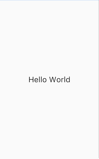
#
垂直和水平佈局多個元件
#最常見的佈局模式之一是垂直或水平排列元件。你可以使用 Row 元件水平排列元件,使用 Column 元件垂直排列元件。
要在 Flutter 中建立行或列,你需要將子元件列表新增到 Row 或 Column 元件。反過來,每個子元件本身又可以是一個行或列,依此類推。以下示例展示瞭如何在行或列中巢狀行或列。
此佈局組織為一個 Row。該行包含兩個子項:左側是一個列,右側是一個影像
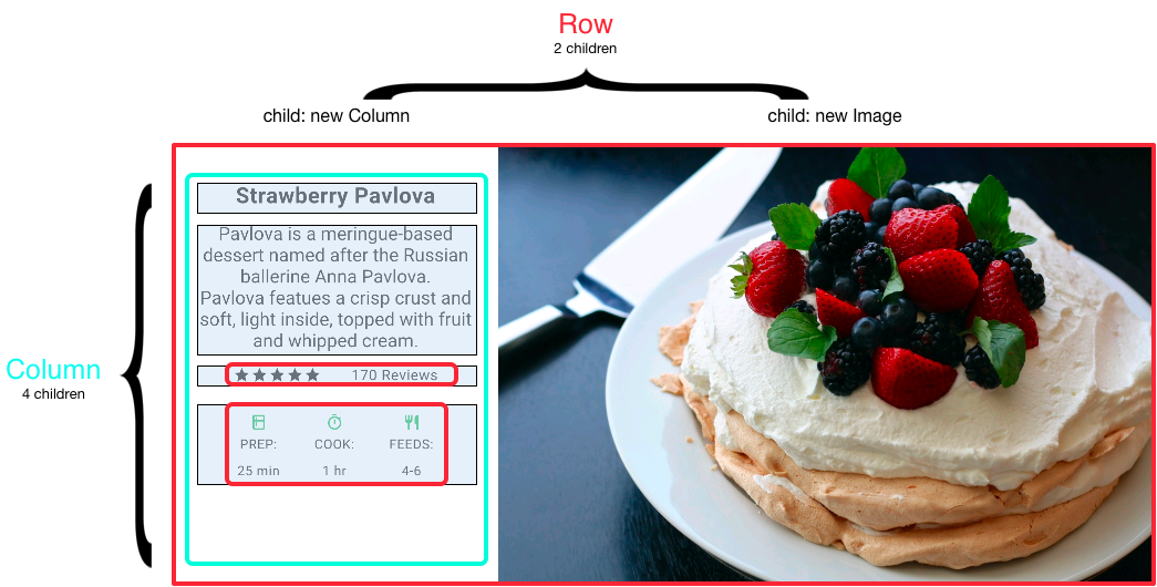
左側列的元件樹嵌套了行和列。
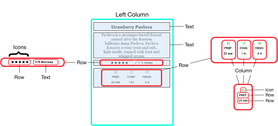
你將在巢狀行和列中實現 Pavlova 的部分佈局程式碼。
對齊元件
#你使用 mainAxisAlignment 和 crossAxisAlignment 屬性控制行或列如何對齊其子項。對於行,主軸水平執行,交叉軸垂直執行。對於列,主軸垂直執行,交叉軸水平執行。
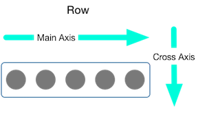
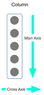
MainAxisAlignment 和 CrossAxisAlignment 列舉提供了各種常量來控制對齊方式。
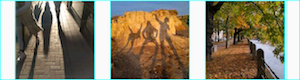
在以下示例中,3 張影像中的每張影像都寬 100 畫素。渲染框(在本例中為整個螢幕)寬度超過 300 畫素,因此將主軸對齊方式設定為 spaceEvenly 會將自由水平空間均勻地分配到每張影像之間、之前和之後。
Row(
  mainAxisAlignment: MainAxisAlignment.spaceEvenly,
  children: [
    Image.asset('images/pic1.jpg'),
    Image.asset('images/pic2.jpg'),
    Image.asset('images/pic3.jpg'),
  ],
);
應用來源:row_column
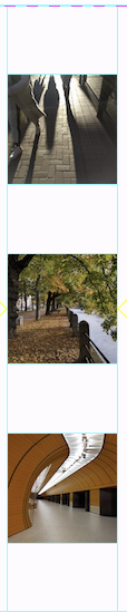
列的工作方式與行相同。以下示例顯示了一列 3 張影像,每張影像高 100 畫素。渲染框(在本例中為整個螢幕)的高度超過 300 畫素,因此將主軸對齊方式設定為 spaceEvenly 會將自由垂直空間均勻地分配到每張影像之間、之上和之下。
Column(
  mainAxisAlignment: MainAxisAlignment.spaceEvenly,
  children: [
    Image.asset('images/pic1.jpg'),
    Image.asset('images/pic2.jpg'),
    Image.asset('images/pic3.jpg'),
  ],
);
應用來源:row_column
調整元件大小
#當佈局過大無法適應裝置時,受影響的邊緣會出現黃黑相間的條紋圖案。這是一個行過寬的示例
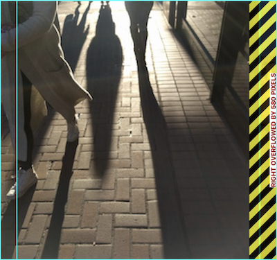
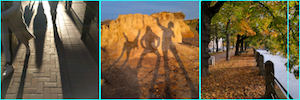
可以透過使用 Expanded 元件來調整元件大小以適應行或列。為了解決上一個示例中影像行對於其渲染框過寬的問題,請用 Expanded 元件包裝每個影像。
Row(
  crossAxisAlignment: CrossAxisAlignment.center,
  children: [
    Expanded(child: Image.asset('images/pic1.jpg')),
    Expanded(child: Image.asset('images/pic2.jpg')),
    Expanded(child: Image.asset('images/pic3.jpg')),
  ],
);
應用來源:sizing
也許你希望一個元件佔用其同級元件兩倍的空間。為此,請使用 Expanded 元件的 flex 屬性,這是一個整數,用於確定元件的 flex 係數。預設的 flex 係數是 1。以下程式碼將中間影像的 flex 係數設定為 2
Row(
  crossAxisAlignment: CrossAxisAlignment.center,
  children: [
    Expanded(child: Image.asset('images/pic1.jpg')),
    Expanded(flex: 2, child: Image.asset('images/pic2.jpg')),
    Expanded(child: Image.asset('images/pic3.jpg')),
  ],
);
應用來源:sizing
緊湊排列元件
#預設情況下,行或列會沿其主軸佔用儘可能多的空間,但如果你想將子項緊密地排列在一起,請將其 mainAxisSize 設定為 MainAxisSize.min。以下示例使用此屬性將星形圖示緊密排列在一起。
Row(
  mainAxisSize: MainAxisSize.min,
  children: [
    Icon(Icons.star, color: Colors.green[500]),
    Icon(Icons.star, color: Colors.green[500]),
    Icon(Icons.star, color: Colors.green[500]),
    const Icon(Icons.star, color: Colors.black),
    const Icon(Icons.star, color: Colors.black),
  ],
)
應用來源:pavlova
巢狀行和列
#佈局框架允許你根據需要深度巢狀行和列。讓我們看看以下佈局中帶輪廓部分的的程式碼
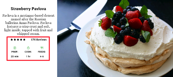
帶輪廓的部分實現為兩行。評分行包含五顆星和評論數量。圖示行包含三列圖示和文字。
評分行的元件樹
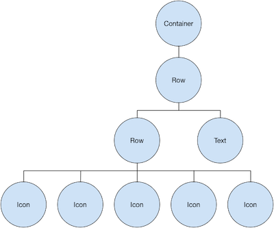
ratings 變數建立了一個包含 5 顆星的小行和文字的行
final stars = Row(
  mainAxisSize: MainAxisSize.min,
  children: [
    Icon(Icons.star, color: Colors.green[500]),
    Icon(Icons.star, color: Colors.green[500]),
    Icon(Icons.star, color: Colors.green[500]),
    const Icon(Icons.star, color: Colors.black),
    const Icon(Icons.star, color: Colors.black),
  ],
);

final ratings = Container(
  padding: const EdgeInsets.all(20),
  child: Row(
    mainAxisAlignment: MainAxisAlignment.spaceEvenly,
    children: [
      stars,
      const Text(
        '170 Reviews',
        style: TextStyle(
          color: Colors.black,
          fontWeight: FontWeight.w800,
          fontFamily: 'Roboto',
          letterSpacing: 0.5,
          fontSize: 20,
        ),
      ),
    ],
  ),
);評分行下方的圖示行包含 3 列;每列包含一個圖示和兩行文字,如其元件樹所示
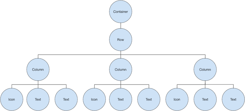
iconList 變數定義了圖示行
const descTextStyle = TextStyle(
  color: Colors.black,
  fontWeight: FontWeight.w800,
  fontFamily: 'Roboto',
  letterSpacing: 0.5,
  fontSize: 18,
  height: 2,
);

// DefaultTextStyle.merge() allows you to create a default text
// style that is inherited by its child and all subsequent children.
final iconList = DefaultTextStyle.merge(
  style: descTextStyle,
  child: Container(
    padding: const EdgeInsets.all(20),
    child: Row(
      mainAxisAlignment: MainAxisAlignment.spaceEvenly,
      children: [
        Column(
          children: [
            Icon(Icons.kitchen, color: Colors.green[500]),
            const Text('PREP:'),
            const Text('25 min'),
          ],
        ),
        Column(
          children: [
            Icon(Icons.timer, color: Colors.green[500]),
            const Text('COOK:'),
            const Text('1 hr'),
          ],
        ),
        Column(
          children: [
            Icon(Icons.restaurant, color: Colors.green[500]),
            const Text('FEEDS:'),
            const Text('4-6'),
          ],
        ),
      ],
    ),
  ),
);
leftColumn 變數包含評分和圖示行,以及描述 Pavlova 的標題和文字
final leftColumn = Container(
  padding: const EdgeInsets.fromLTRB(20, 30, 20, 20),
  child: Column(children: [titleText, subTitle, ratings, iconList]),
);
左列放置在 SizedBox 中以限制其寬度。最後,使用包含左列和影像的整個行在 Card 內部構建 UI。
Pavlova 圖片來自 Pixabay。你可以使用 Image.network() 嵌入來自網路的圖片,但在此示例中,圖片已儲存到專案中的 images 目錄,新增到 pubspec 檔案中,並使用 Images.asset() 訪問。有關更多資訊,請參閱新增資產和影像。
body: Center(
  child: Container(
    margin: const EdgeInsets.fromLTRB(0, 40, 0, 30),
    height: 600,
    child: Card(
      child: Row(
        crossAxisAlignment: CrossAxisAlignment.start,
        children: [
          SizedBox(width: 440, child: leftColumn),
          mainImage,
        ],
      ),
    ),
  ),
),應用來源:pavlova
常用佈局元件
#Flutter 擁有豐富的佈局元件庫。以下是一些最常用的元件。目的是讓你儘快上手,而不是用完整的列表讓你不知所措。有關其他可用元件的資訊,請參閱元件目錄,或使用 API 參考文件中的搜尋框。此外,API 文件中的元件頁面通常會提供關於可能更適合你需求的類似元件的建議。
以下元件分為兩類:來自元件庫的標準組件,以及來自Material 庫的專用元件。任何應用都可以使用元件庫,但只有 Material 應用才能使用 Material Components 庫。
CupertinoPageScaffold- 為 iOS 風格的頁面提供基本佈局結構。
CupertinoNavigationBar- 在螢幕頂部建立 iOS 風格的導航欄。
CupertinoSegmentedControl- 建立一個用於選擇的分段控制元件。
CupertinoTabBar和CupertinoTabScaffold- 建立 iOS 特有的底部選項卡欄。
容器
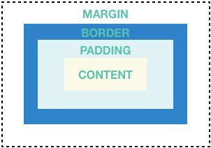
#許多佈局大量使用 Container 來使用內邊距分隔元件,或新增邊框或外邊距。你可以透過將整個佈局放置在 Container 中並更改其背景顏色或影像來更改裝置的背景。
總結 (Container)
#- 新增內邊距、外邊距、邊框
- 更改背景顏色或影像
- 包含一個子元件,但該子元件可以是
Row、Column,甚至是元件樹的根
示例 (Container)
#此佈局由一個包含兩行的列組成,每行包含 2 張影像。使用 Container 將列的背景顏色更改為較淺的灰色。
Widget _buildImageColumn() {
  return Container(
    decoration: const BoxDecoration(color: Colors.black26),
    child: Column(children: [_buildImageRow(1), _buildImageRow(3)]),
  );
}
Container 也用於為每個影像新增圓角邊框和外邊距
Widget _buildDecoratedImage(int imageIndex) => Expanded(
  child: Container(
    decoration: BoxDecoration(
      border: Border.all(width: 10, color: Colors.black38),
      borderRadius: const BorderRadius.all(Radius.circular(8)),
    ),
    margin: const EdgeInsets.all(4),
    child: Image.asset('images/pic$imageIndex.jpg'),
  ),
);

Widget _buildImageRow(int imageIndex) => Row(
  children: [
    _buildDecoratedImage(imageIndex),
    _buildDecoratedImage(imageIndex + 1),
  ],
);你可以在教程中找到更多 Container 示例。
應用來源:container
GridView
#使用 GridView 將元件佈局為二維列表。GridView 提供兩種預製的列表,或者你可以構建自己的自定義網格。當 GridView 檢測到其內容太長而無法適應渲染框時,它會自動滾動。
總結 (GridView)
#- 以網格形式佈局元件
- 檢測到列內容超出渲染框時自動提供滾動
- 構建你自己的自定義網格,或使用提供的網格之一
GridView.count允許你指定列數GridView.extent允許你指定瓦片的最大畫素寬度
示例 (GridView)
#
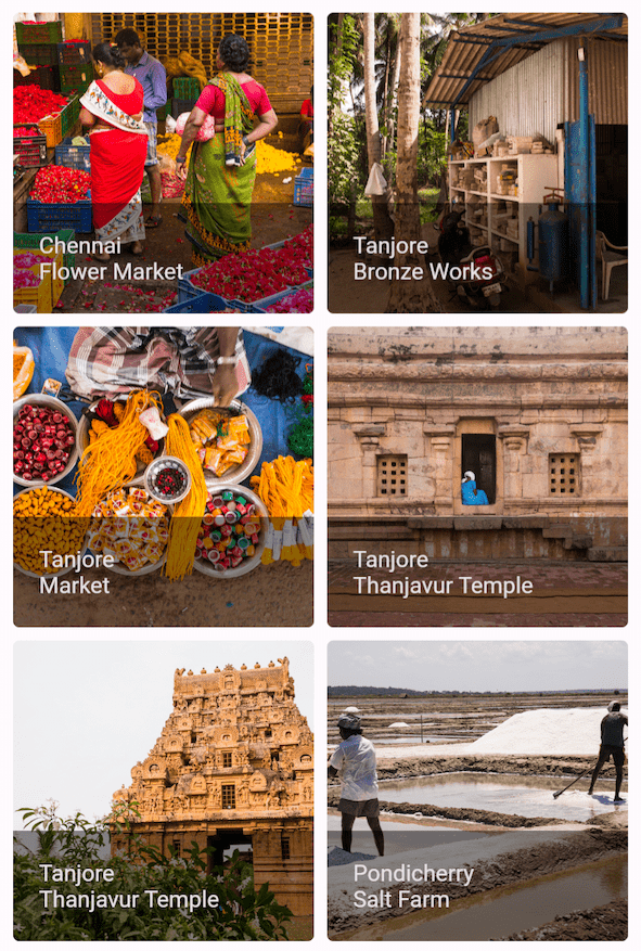
使用 GridView.count 建立一個在縱向模式下寬 2 個瓦片,橫向模式下寬 3 個瓦片的網格。標題是透過設定每個 GridTile 的 footer 屬性建立的。
Dart 程式碼:grid_list_demo.dart
Widget _buildGrid() => GridView.extent(
  maxCrossAxisExtent: 150,
  padding: const EdgeInsets.all(4),
  mainAxisSpacing: 4,
  crossAxisSpacing: 4,
  children: _buildGridTileList(30),
);

// The images are saved with names pic0.jpg, pic1.jpg...pic29.jpg.
// The List.generate() constructor allows an easy way to create
// a list when objects have a predictable naming pattern.
List<Widget> _buildGridTileList(int count) =>
    List.generate(count, (i) => Image.asset('images/pic$i.jpg'));
ListView
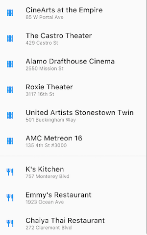
#ListView 是一個類似列的元件,當其內容對於渲染框來說太長時,會自動提供滾動。
總結 (ListView)
#- 一個用於組織盒子列表的專用
Column - 可以水平或垂直佈局
- 檢測到其內容不適合時提供滾動
- 比
Column配置性差,但更容易使用並支援滾動
示例 (ListView)
#
Widget _buildList() {
  return ListView(
    children: [
      _tile('CineArts at the Empire', '85 W Portal Ave', Icons.theaters),
      _tile('The Castro Theater', '429 Castro St', Icons.theaters),
      _tile('Alamo Drafthouse Cinema', '2550 Mission St', Icons.theaters),
      _tile('Roxie Theater', '3117 16th St', Icons.theaters),
      _tile(
        'United Artists Stonestown Twin',
        '501 Buckingham Way',
        Icons.theaters,
      ),
      _tile('AMC Metreon 16', '135 4th St #3000', Icons.theaters),
      const Divider(),
      _tile('K\'s Kitchen', '757 Monterey Blvd', Icons.restaurant),
      _tile('Emmy\'s Restaurant', '1923 Ocean Ave', Icons.restaurant),
      _tile('Chaiya Thai Restaurant', '272 Claremont Blvd', Icons.restaurant),
      _tile('La Ciccia', '291 30th St', Icons.restaurant),
    ],
  );
}

ListTile _tile(String title, String subtitle, IconData icon) {
  return ListTile(
    title: Text(
      title,
      style: const TextStyle(fontWeight: FontWeight.w500, fontSize: 20),
    ),
    subtitle: Text(subtitle),
    leading: Icon(icon, color: Colors.blue[500]),
  );
}
層疊佈局
#使用 Stack 將元件排列在一個基礎元件(通常是影像)之上。元件可以完全或部分覆蓋基礎元件。
總結 (Stack)
#- 用於重疊其他元件的元件
- 子元件列表中的第一個元件是基礎元件;隨後的子元件覆蓋在該基礎元件之上
Stack的內容無法滾動- 你可以選擇裁剪超出渲染框的子元件
示例 (Stack)
#
使用 Stack 將 Container(在半透明黑色背景上顯示其 Text)疊加在 CircleAvatar 上。Stack 使用 alignment 屬性和 Alignments 偏移文字。
應用來源:card_and_stack

Widget _buildStack() {
  return Stack(
    alignment: const Alignment(0.6, 0.6),
    children: [
      const CircleAvatar(
        backgroundImage: AssetImage('images/pic.jpg'),
        radius: 100,
      ),
      Container(
        decoration: const BoxDecoration(color: Colors.black45),
        child: const Text(
          'Mia B',
          style: TextStyle(
            fontSize: 20,
            fontWeight: FontWeight.bold,
            color: Colors.white,
          ),
        ),
      ),
    ],
  );
}
Card
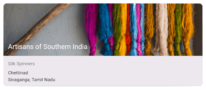
#來自 Material 庫的 Card 包含相關的資訊片段,可以由幾乎任何元件組成,但通常與 ListTile 一起使用。Card 有一個子元件,但其子元件可以是列、行、列表、網格或其他支援多個子元件的元件。預設情況下,Card 將其大小縮小到 0x0 畫素。你可以使用 SizedBox 來限制卡片的大小。
在 Flutter 中,Card 具有略微圓潤的邊角和陰影,賦予其 3D 效果。更改 Card 的 elevation 屬性可以控制陰影效果。例如,將高度設定為 24 會在視覺上將 Card 進一步從表面抬起,並導致陰影變得更加分散。有關支援的高度值列表,請參閱 Material 指南中的高度。指定不支援的值會完全停用陰影。
總結 (Card)
#- 實現 Material 卡片
- 用於呈現相關資訊片段
- 接受單個子元件,但該子元件可以是
Row、Column或其他包含子元件列表的元件 - 以圓角和陰影顯示
Card的內容無法滾動- 來自 Material 庫
示例 (Card)
#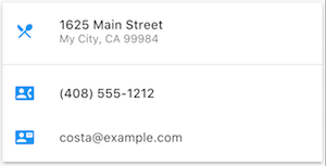
Widget _buildCard() {
  return SizedBox(
    height: 210,
    child: Card(
      child: Column(
        children: [
          ListTile(
            title: const Text(
              '1625 Main Street',
              style: TextStyle(fontWeight: FontWeight.w500),
            ),
            subtitle: const Text('My City, CA 99984'),
            leading: Icon(Icons.restaurant_menu, color: Colors.blue[500]),
          ),
          const Divider(),
          ListTile(
            title: const Text(
              '(408) 555-1212',
              style: TextStyle(fontWeight: FontWeight.w500),
            ),
            leading: Icon(Icons.contact_phone, color: Colors.blue[500]),
          ),
          ListTile(
            title: const Text('costa@example.com'),
            leading: Icon(Icons.contact_mail, color: Colors.blue[500]),
          ),
        ],
      ),
    ),
  );
}
ListTile
#使用 ListTile(來自 Material 庫的專用行元件)可以輕鬆建立包含最多 3 行文字以及可選的前導和尾隨圖示的行。ListTile 最常用於 Card 或 ListView,但也可以用於其他地方。
總結 (ListTile)
#- 包含最多 3 行文字和可選圖示的專用行
- 比
Row配置性差,但更容易使用 - 來自 Material 庫
示例 (ListTile)
#
約束
#要完全理解 Flutter 的佈局系統,你需要學習 Flutter 如何定位和調整佈局中的元件大小。有關更多資訊,請參閱理解約束。
影片
#以下影片是 Flutter in Focus 系列的一部分,解釋了 Stateless 和 Stateful 元件。
每週元件系列的每一集都專注於一個元件。其中一些包括佈局元件。
其他資源
#以下資源可能有助於編寫佈局程式碼。
- 佈局教程
- 學習如何構建佈局。
- 元件目錄
- 描述了 Flutter 中可用的許多元件。
- Flutter 中的 HTML/CSS 類比
- 對於熟悉 Web 程式設計的人來說,此頁面將 HTML/CSS 功能對映到 Flutter 特性。
- API 參考文件
- 所有 Flutter 庫的參考文件。
- 新增資產和影像
- 解釋如何將影像和其他資產新增到你的應用包中。
- Flutter 從零到一
- 一個人編寫第一個 Flutter 應用的經驗。