Flutter 開發者指南:致 SwiftUI 開發者
希望使用 Flutter 編寫移動應用的 SwiftUI 開發者應查閱本指南。本指南解釋瞭如何將現有的 SwiftUI 知識應用於 Flutter。
Flutter 是一個用於構建跨平臺應用的框架,它使用 Dart 程式語言。要了解 Dart 程式設計與 Swift 程式設計之間的一些差異,請參閱Swift 開發者學習 Dart 和Swift 開發者瞭解 Flutter 併發。
在用 Flutter 進行構建時,你的 SwiftUI 知識和經驗非常有價值。
Flutter 還在 iOS 和 macOS 上執行時對應用行為進行了多項調整。要了解具體方法,請參閱平臺適配。
本文件可以用作一本食譜,你可以跳到最符合你需求的問題。本指南嵌入了示例程式碼。透過使用懸停或聚焦時出現的“在 DartPad 中開啟”按鈕,你可以在 DartPad 上開啟並執行一些示例。
概述
#作為介紹,請觀看以下影片。它概述了 Flutter 在 iOS 上的工作原理以及如何使用 Flutter 構建 iOS 應用。
Flutter 和 SwiftUI 程式碼描述了 UI 的外觀和工作方式。開發者將這種型別的程式碼稱為*宣告式框架*。
檢視 vs. 小部件
#**SwiftUI** 將 UI 元件表示為*檢視*。你使用*修飾符*配置檢視。
Text("Hello, World!") // <-- This is a View
  .padding(10)        // <-- This is a modifier of that View
**Flutter** 將 UI 元件表示為*小部件*。
檢視和小部件都只存在到需要更改時。這些語言將此屬性稱為*不變性*。SwiftUI 將 UI 元件屬性表示為檢視修飾符。相比之下,Flutter 將小部件用於 UI 元件及其屬性。
Padding(                         // <-- This is a Widget
  padding: EdgeInsets.all(10.0), // <-- So is this
  child: Text("Hello, World!"),  // <-- This, too
)));
為了組合佈局,SwiftUI 和 Flutter 都將 UI 元件巢狀在一起。SwiftUI 巢狀檢視,而 Flutter 巢狀小部件。
佈局過程
#**SwiftUI** 使用以下過程來佈局檢視
- 父檢視向其子檢視建議一個大小。
- 所有後續子檢視
- 向*它們*的子檢視建議一個大小
- 詢問該子檢視它想要什麼大小
- 每個父檢視以返回的大小渲染其子檢視。
**Flutter** 的過程有所不同
父小部件將約束傳遞給其子小部件。約束包括高度和寬度的最小值和最大值。
子小部件嘗試決定其大小。它對其自己的子小部件列表重複相同的過程
- 它告知其子小部件子小部件的約束。
- 它詢問其子小部件它希望是什麼大小。
父小部件佈局子小部件。
- 如果請求的大小符合約束,則父小部件使用該大小。
- 如果請求的大小不符合約束,則父小部件限制高度、寬度或兩者以適應其約束。
Flutter 與 SwiftUI 不同,因為父元件可以覆蓋子元件的所需大小。小部件不能擁有任何它想要的大小。它也無法知道或決定它在螢幕上的位置,因為其父元件做出該決定。
要強制子小部件以特定大小渲染,父小部件必須設定緊密約束。當其約束的最小大小值等於其最大大小值時,約束變為緊密。
在 **SwiftUI** 中,檢視可能會擴充套件到可用空間或將其大小限制為其內容的大小。**Flutter** 小部件的行為方式類似。
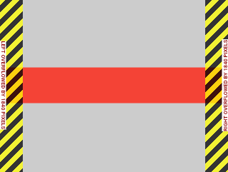
然而,在 Flutter 中,父小部件可以提供無邊界約束。無邊界約束將其最大值設定為無窮大。
UnboundedBox(
  child: Container(
      width: double.infinity, height: double.infinity, color: red),
)
如果子小部件擴充套件且具有無邊界約束,Flutter 將返回溢位警告
UnconstrainedBox(
  child: Container(color: red, width: 4000, height: 50),
)
要了解 Flutter 中約束的工作原理,請參閱理解約束。
設計系統
#因為 Flutter 針對多個平臺,所以你的應用不需要符合任何設計系統。儘管本指南以 Material 小部件為特色,但你的 Flutter 應用可以使用許多不同的設計系統
- 自定義 Material 小部件
- 社群構建的小部件
- 你自己的自定義小部件
- 遵循 Apple 人機介面指南的Cupertino 小部件
在新標籤頁中觀看 YouTube 影片:“Flutter's cupertino library for iOS developers”
如果你正在尋找一個具有自定義設計系統的優秀參考應用,請檢視 Wonderous。
UI 基礎
#本節涵蓋 Flutter 中 UI 開發的基礎知識,以及它與 SwiftUI 的比較。這包括如何開始開發應用、顯示靜態文字、建立按鈕、響應按壓事件、顯示列表、網格等。
入門
#在 **SwiftUI** 中,你使用 App 來啟動你的應用。
@main
struct MyApp: App {
    var body: some Scene {
        WindowGroup {
            HomePage()
        }
    }
}
另一個常見的 SwiftUI 實踐是將應用主體放在符合 View 協議的 struct 中,如下所示
struct HomePage: View {
  var body: some View {
    Text("Hello, World!")
  }
}
要啟動你的 **Flutter** 應用,將你的應用例項傳遞給 runApp 函式。
void main() {
  runApp(const MyApp());
}
App 是一個小部件。build 方法描述了它所代表的使用者介面部分。通常,你的應用會以 WidgetApp 類(例如 CupertinoApp)開始。
class MyApp extends StatelessWidget {
  const MyApp({super.key});

  @override
  Widget build(BuildContext context) {
    // Returns a CupertinoApp that, by default,
    // has the look and feel of an iOS app.
    return const CupertinoApp(home: HomePage());
  }
}
HomePage 中使用的小部件可能以 Scaffold 類開始。Scaffold 為應用實現了一個基本的佈局結構。
class HomePage extends StatelessWidget {
  const HomePage({super.key});

  @override
  Widget build(BuildContext context) {
    return const Scaffold(body: Center(child: Text('Hello, World!')));
  }
}
請注意 Flutter 如何使用 Center 小部件。SwiftUI 預設將其檢視內容渲染在其中心。Flutter 則並非總是如此。Scaffold 不會在螢幕中心渲染其 body 小部件。要使文字居中,請將其包裝在 Center 小部件中。要了解不同小部件及其預設行為,請檢視小部件目錄。
新增按鈕
#在 **SwiftUI** 中,你使用 Button 結構體來建立按鈕。
Button("Do something") {
  // this closure gets called when your
  // button is tapped
}
要在 **Flutter** 中實現相同的結果,請使用 CupertinoButton 類
CupertinoButton(
  onPressed: () {
    // This closure is called when your button is tapped.
  },
  const Text('Do something'),
),
**Flutter** 為你提供了各種具有預定義樣式的按鈕。 CupertinoButton 類來自 Cupertino 庫。Cupertino 庫中的小部件使用 Apple 的設計系統。
水平對齊元件
#在 **SwiftUI** 中,堆疊檢視在設計佈局中扮演著重要角色。兩個獨立的結構允許你建立堆疊
HStack用於水平堆疊檢視VStack用於垂直堆疊檢視
以下 SwiftUI 檢視將一個地球影像和文字新增到水平堆疊檢視中
HStack {
  Image(systemName: "globe")
  Text("Hello, world!")
}
**Flutter** 使用 Row 而不是 HStack
Row(
  mainAxisAlignment: MainAxisAlignment.center,
  children: [Icon(CupertinoIcons.globe), Text('Hello, world!')],
),
Row 小部件在 children 引數中需要一個 List<Widget>。mainAxisAlignment 屬性告訴 Flutter 如何在額外空間中定位子小部件。MainAxisAlignment.center 將子小部件定位在主軸的中心。對於 Row,主軸是水平軸。
垂直對齊元件
#以下示例基於上一節中的示例。
在 **SwiftUI** 中,你使用 VStack 將元件排列成垂直柱。
VStack {
  Image(systemName: "globe")
  Text("Hello, world!")
}
**Flutter** 使用與上一個示例相同的 Dart 程式碼,只是它將 Column 替換為 Row
Column(
  mainAxisAlignment: MainAxisAlignment.center,
  children: [Icon(CupertinoIcons.globe), Text('Hello, world!')],
),
顯示列表檢視
#在 **SwiftUI** 中,你使用 List 基本元件來顯示專案序列。要顯示模型物件序列,請確保使用者可以識別你的模型物件。要使物件可識別,請使用 Identifiable 協議。
struct Person: Identifiable {
  var name: String
}

var persons = [
  Person(name: "Person 1"),
  Person(name: "Person 2"),
  Person(name: "Person 3"),
]

struct ListWithPersons: View {
  let persons: [Person]
  var body: some View {
    List {
      ForEach(persons) { person in
        Text(person.name)
      }
    }
  }
}
這類似於 **Flutter** 傾向於構建其列表小部件的方式。Flutter 不需要列表項是可識別的。你設定要顯示的專案數量,然後為每個專案構建一個小部件。
class Person {
  String name;
  Person(this.name);
}

final List<Person> items = [
  Person('Person 1'),
  Person('Person 2'),
  Person('Person 3'),
];

class HomePage extends StatelessWidget {
  const HomePage({super.key});

  @override
  Widget build(BuildContext context) {
    return Scaffold(
      body: ListView.builder(
        itemCount: items.length,
        itemBuilder: (context, index) {
          return ListTile(title: Text(items[index].name));
        },
      ),
    );
  }
}
Flutter 的列表有一些注意事項
ListView小部件有一個構建器方法。這類似於 SwiftUIList結構體中的ForEach。ListView的itemCount引數設定ListView顯示的專案數量。itemBuilder有一個索引引數,該引數將在零到 itemCount 減一之間。
前面的示例為每個專案返回了一個 ListTile 小部件。ListTile 小部件包括 height 和 font-size 等屬性。這些屬性有助於構建列表。但是,Flutter 允許你返回幾乎任何代表你資料的小部件。
顯示網格
#在 **SwiftUI** 中構建非條件網格時,你使用 Grid 和 GridRow。
Grid {
  GridRow {
    Text("Row 1")
    Image(systemName: "square.and.arrow.down")
    Image(systemName: "square.and.arrow.up")
  }
  GridRow {
    Text("Row 2")
    Image(systemName: "square.and.arrow.down")
    Image(systemName: "square.and.arrow.up")
  }
}
要在 **Flutter** 中顯示網格,請使用 GridView 小部件。此小部件有各種建構函式。每個建構函式都有相似的目標,但使用不同的輸入引數。以下示例使用 .builder() 初始化器
const widgets = [
  Text('Row 1'),
  Icon(CupertinoIcons.arrow_down_square),
  Icon(CupertinoIcons.arrow_up_square),
  Text('Row 2'),
  Icon(CupertinoIcons.arrow_down_square),
  Icon(CupertinoIcons.arrow_up_square),
];

class HomePage extends StatelessWidget {
  const HomePage({super.key});

  @override
  Widget build(BuildContext context) {
    return Scaffold(
      body: GridView.builder(
        gridDelegate: const SliverGridDelegateWithFixedCrossAxisCount(
          crossAxisCount: 3,
          mainAxisExtent: 40,
        ),
        itemCount: widgets.length,
        itemBuilder: (context, index) => widgets[index],
      ),
    );
  }
}
SliverGridDelegateWithFixedCrossAxisCount 委託確定網格用於佈局其元件的各種引數。這包括 crossAxisCount,它指定每行顯示的專案數量。
SwiftUI 的 Grid 和 Flutter 的 GridView 的區別在於 Grid 需要 GridRow。GridView 使用委託來決定網格應該如何佈局其元件。
建立滾動檢視
#在 **SwiftUI** 中,你使用 ScrollView 來建立自定義滾動元件。以下示例以可滾動的方式顯示一系列 PersonView 例項。
ScrollView {
  VStack(alignment: .leading) {
    ForEach(persons) { person in
      PersonView(person: person)
    }
  }
}
要建立滾動檢視,**Flutter** 使用 SingleChildScrollView。在以下示例中,函式 mockPerson 模擬 Person 類的例項以建立自定義 PersonView 小部件。
SingleChildScrollView(
  child: Column(
    children: mockPersons
        .map((person) => PersonView(person: person))
        .toList(),
  ),
),
響應式和自適應設計
#在 **SwiftUI** 中,你使用 GeometryReader 來建立相對檢視大小。
例如,你可以
- 將
geometry.size.width乘以某個因子來設定*寬度*。 - 使用
GeometryReader作為斷點來改變應用的設計。
你還可以使用 horizontalSizeClass 檢視大小類是否為 .regular 或 .compact。
要在 **Flutter** 中建立相對檢視,你可以使用以下兩種選項之一
- 在
LayoutBuilder類中獲取BoxConstraints物件。 - 在你的構建函式中使用
MediaQuery.of()來獲取當前應用的大小和方向。
要了解更多資訊,請檢視建立響應式和自適應應用。
狀態管理
#在 **SwiftUI** 中,你使用 @State 屬性包裝器來表示 SwiftUI 檢視的內部狀態。
struct ContentView: View {
  @State private var counter = 0;
  var body: some View {
    VStack{
      Button("+") { counter+=1 }
      Text(String(counter))
    }
  }}
**SwiftUI** 還包括幾種用於更復雜狀態管理的選項,例如 ObservableObject 協議。
**Flutter** 使用 StatefulWidget 管理本地狀態。使用以下兩個類實現有狀態小部件
StatefulWidget的子類State的子類
State 物件儲存小部件的狀態。要更改小部件的狀態,從 State 子類呼叫 setState() 以告知框架重新繪製小部件。
以下示例展示了計數器應用的一部分
class MyHomePage extends StatefulWidget {
  const MyHomePage({super.key});
  @override
  State<MyHomePage> createState() => _MyHomePageState();
}

class _MyHomePageState extends State<MyHomePage> {
  int _counter = 0;

  @override
  Widget build(BuildContext context) {
    return Scaffold(
      body: Center(
        child: Column(
          mainAxisAlignment: MainAxisAlignment.center,
          children: [
            Text('$_counter'),
            TextButton(
              onPressed: () => setState(() {
                _counter++;
              }),
              child: const Text('+'),
            ),
          ],
        ),
      ),
    );
  }
}要了解更多管理狀態的方法,請檢視狀態管理。
動畫
#存在兩種主要型別的 UI 動畫。
- 隱式動畫:從當前值動畫到新目標。
- 顯式動畫:在被要求時進行動畫。
隱式動畫
#SwiftUI 和 Flutter 採用相似的動畫方法。在這兩個框架中,你都指定了諸如 duration 和 curve 之類的引數。
在 **SwiftUI** 中,你使用 animate() 修飾符來處理隱式動畫。
Button("Tap me!"){
   angle += 45
}
.rotationEffect(.degrees(angle))
.animation(.easeIn(duration: 1))
**Flutter** 包含用於隱式動畫的小部件。這簡化了常見小部件的動畫。Flutter 以以下格式命名這些小部件:AnimatedFoo。
例如:要旋轉按鈕,請使用 AnimatedRotation 類。這將對 Transform.rotate 小部件進行動畫處理。
AnimatedRotation(
  duration: const Duration(seconds: 1),
  turns: turns,
  curve: Curves.easeIn,
  TextButton(
    onPressed: () {
      setState(() {
        turns += .125;
      });
    },
    const Text('Tap me!'),
  ),
),
Flutter 允許你建立自定義隱式動畫。要組合新的動畫小部件,請使用 TweenAnimationBuilder。
顯式動畫
#對於顯式動畫,**SwiftUI** 使用 withAnimation() 函式。
**Flutter** 包含名稱格式為 FooTransition 的顯式動畫小部件。一個示例是 RotationTransition 類。
Flutter 還允許你使用 AnimatedWidget 或 AnimatedBuilder 建立自定義顯式動畫。
要了解有關 Flutter 中動畫的更多資訊,請參閱動畫概述。
在螢幕上繪圖
#在 **SwiftUI** 中,你使用 CoreGraphics 在螢幕上繪製線條和形狀。
**Flutter** 有一個基於 Canvas 類的 API,其中有兩個類可以幫助你繪製
需要繪製器的
CustomPaintdartCustomPaint( painter: SignaturePainter(_points), size: Size.infinite, ),實現你的演算法以繪製到畫布的
CustomPainterdartclass SignaturePainter extends CustomPainter { SignaturePainter(this.points); final List<Offset?> points; @override void paint(Canvas canvas, Size size) { final Paint paint = Paint() ..color = Colors.black ..strokeCap = StrokeCap.round ..strokeWidth = 5; for (int i = 0; i < points.length - 1; i++) { if (points[i] != null && points[i + 1] != null) { canvas.drawLine(points[i]!, points[i + 1]!, paint); } } } @override bool shouldRepaint(SignaturePainter oldDelegate) => oldDelegate.points != points; }
導航
#本節解釋瞭如何在應用頁面之間導航、推入和彈出機制等等。
頁面導航
#開發者使用稱為*導航路由*的不同頁面構建 iOS 和 macOS 應用。
在 **SwiftUI** 中,NavigationStack 代表了這種頁面堆疊。
以下示例建立了一個顯示人員列表的應用。要在新導航連結中顯示人員的詳細資訊,請點選該人員。
NavigationStack(path: $path) {
      List {
        ForEach(persons) { person in
          NavigationLink(
            person.name,
            value: person
          )
        }
      }
      .navigationDestination(for: Person.self) { person in
        PersonView(person: person)
      }
    }
如果你的 **Flutter** 應用很小且沒有複雜的連結,請使用 Navigator 和命名路由。定義導航路由後,使用它們的名稱呼叫你的導航路由。
在傳遞給
runApp()函式的類中命名每個路由。以下示例使用Appdart// Defines the route name as a constant // so that it's reusable. const detailsPageRouteName = '/details'; class App extends StatelessWidget { const App({super.key}); @override Widget build(BuildContext context) { return CupertinoApp( home: const HomePage(), // The [routes] property defines the available named routes // and the widgets to build when navigating to those routes. routes: {detailsPageRouteName: (context) => const DetailsPage()}, ); } }以下示例使用
mockPersons()生成人員列表。點選一個人會將該人員的詳細資訊頁面使用pushNamed()推入Navigator。dartListView.builder( itemCount: mockPersons.length, itemBuilder: (context, index) { final person = mockPersons.elementAt(index); final age = '${person.age} years old'; return ListTile( title: Text(person.name), subtitle: Text(age), trailing: const Icon(Icons.arrow_forward_ios), onTap: () { // When a [ListTile] that represents a person is // tapped, push the detailsPageRouteName route // to the Navigator and pass the person's instance // to the route. Navigator.of( context, ).pushNamed(detailsPageRouteName, arguments: person); }, ); }, ),定義顯示每個人詳細資訊的
DetailsPage小部件。在 Flutter 中,你可以在導航到新路由時將引數傳遞到小部件中。使用ModalRoute.of()提取引數dartclass DetailsPage extends StatelessWidget { const DetailsPage({super.key}); @override Widget build(BuildContext context) { // Read the person instance from the arguments. final Person person = ModalRoute.of(context)?.settings.arguments as Person; // Extract the age. final age = '${person.age} years old'; return Scaffold( // Display name and age. body: Column(children: [Text(person.name), Text(age)]), ); } }
要建立更高階的導航和路由要求,請使用路由包,例如 go_router。
要了解更多資訊,請檢視導航和路由。
手動返回
#在 **SwiftUI** 中,你使用 dismiss 環境值來返回到上一個螢幕。
Button("Pop back") {
        dismiss()
      }
在 **Flutter** 中,使用 Navigator 類的 pop() 函式
TextButton(
  onPressed: () {
    // This code allows the
    // view to pop back to its presenter.
    Navigator.of(context).pop();
  },
  child: const Text('Pop back'),
),
導航到另一個應用
#在 **SwiftUI** 中,你使用 openURL 環境變數來開啟 URL 到另一個應用程式。
@Environment(\.openURL) private var openUrl

// View code goes here

 Button("Open website") {
      openUrl(
        URL(
          string: "https://google.com"
        )!
      )
    }
在 **Flutter** 中,使用 url_launcher 外掛。
CupertinoButton(
  onPressed: () async {
    await launchUrl(Uri.parse('https://google.com'));
  },
  const Text('Open website'),
),
主題、樣式和媒體
#你可以毫不費力地為 Flutter 應用設定樣式。樣式包括在亮色和深色主題之間切換、更改文字和 UI 元件的設計等等。本節介紹瞭如何為你的應用設定樣式。
使用深色模式
#在 **SwiftUI** 中,你在 View 上呼叫 preferredColorScheme() 函式以使用深色模式。
在 **Flutter** 中,你可以在應用級別控制亮色和深色模式。要控制亮度模式,請使用 App 類的 theme 屬性
const CupertinoApp(
  theme: CupertinoThemeData(brightness: Brightness.dark),
  home: HomePage(),
);
文字樣式
#在 **SwiftUI** 中,你使用修飾符函式來設定文字樣式。例如,要更改 Text 字串的字型,請使用 font() 修飾符
Text("Hello, world!")
  .font(.system(size: 30, weight: .heavy))
  .foregroundColor(.yellow)
要在 **Flutter** 中設定文字樣式,請將 TextStyle 小部件作為 Text 小部件的 style 引數的值。
Text(
  'Hello, world!',
  style: TextStyle(
    fontSize: 30,
    fontWeight: FontWeight.bold,
    color: CupertinoColors.systemYellow,
  ),
),
按鈕樣式
#在 **SwiftUI** 中,你使用修飾符函式來設定按鈕樣式。
Button("Do something") {
    // do something when button is tapped
  }
  .font(.system(size: 30, weight: .bold))
  .background(Color.yellow)
  .foregroundColor(Color.blue)
}
要在 **Flutter** 中設定按鈕小部件的樣式,請設定其子項的樣式,或修改按鈕本身的屬性。
在以下示例中
CupertinoButton的color屬性設定其color。- 子
Text小部件的color屬性設定按鈕文字顏色。
child: CupertinoButton(
  color: CupertinoColors.systemYellow,
  onPressed: () {},
  padding: const EdgeInsets.all(16),
  child: const Text(
    'Do something',
    style: TextStyle(
      color: CupertinoColors.systemBlue,
      fontSize: 30,
      fontWeight: FontWeight.bold,
    ),
  ),
),
使用自定義字型
#在 **SwiftUI** 中,你可以透過兩個步驟在應用中使用自定義字型。首先,將字型檔案新增到你的 SwiftUI 專案中。新增檔案後,使用 .font() 修飾符將其應用於你的 UI 元件。
Text("Hello")
  .font(
    Font.custom(
      "BungeeSpice-Regular",
      size: 40
    )
  )
在 **Flutter** 中,你使用名為 pubspec.yaml 的檔案控制你的資源。此檔案與平臺無關。要將自定義字型新增到你的專案,請按照以下步驟操作
在專案的根目錄中建立一個名為
fonts的資料夾。此可選步驟有助於組織你的字型。將你的
.ttf、.otf或.ttc字型檔案新增到fonts資料夾中。開啟專案中的
pubspec.yaml檔案。找到
flutter部分。在
fonts部分下新增你的自定義字型。yamlflutter: fonts: - family: BungeeSpice fonts: - asset: fonts/BungeeSpice-Regular.ttf
將字型新增到你的專案後,你可以按照以下示例使用它
Text(
  'Cupertino',
  style: TextStyle(fontSize: 40, fontFamily: 'BungeeSpice'),
),在應用中捆綁圖片
#在 **SwiftUI** 中,你首先將影像檔案新增到 Assets.xcassets,然後使用 Image 檢視來顯示影像。
要在 **Flutter** 中新增影像,請遵循與新增自定義字型類似的方法。
在根目錄中新增一個
images資料夾。將此資產新增到
pubspec.yaml檔案。yamlflutter: assets: - images/Blueberries.jpg
新增影像後,使用 Image 小部件的 .asset() 建構函式顯示它。此建構函式
- 使用提供的路徑例項化給定的影像。
- 從與你的應用捆綁的資產中讀取影像。
- 在螢幕上顯示影像。
要檢視完整示例,請檢視 Image 文件。
在應用中捆綁影片
#在 **SwiftUI** 中,你透過兩個步驟將本地影片檔案捆綁到你的應用中。首先,你匯入 AVKit 框架,然後例項化一個 VideoPlayer 檢視。
在 **Flutter** 中,將 video_player 外掛新增到你的專案。此外掛允許你建立一個可在 Android、iOS 和 Web 上使用相同程式碼庫執行的影片播放器。
- 將外掛新增到你的應用並將影片檔案新增到你的專案。
- 將資產新增到你的
pubspec.yaml檔案。 - 使用
VideoPlayerController類載入和播放你的影片檔案。
要檢視完整的演練,請檢視 video_player 示例。