建立打字指示器
現代聊天應用程式會在其他使用者主動輸入回覆時顯示指示器。這些指示器有助於防止您與對方之間發生快速且衝突的響應。在本食譜中,您將構建一個語音氣泡式打字指示器,該指示器會進出檢視進行動畫。
以下動畫展示了應用程式的行為
定義打字指示器小部件
#打字指示器存在於自己的小部件中,以便可以在應用程式的任何地方使用。與任何控制動畫的小部件一樣,打字指示器需要是無狀態小部件。該小部件接受一個布林值,該值決定指示器是否可見。這種語音氣泡式打字指示器接受氣泡的顏色,以及大語音氣泡內閃爍圓圈的亮色和暗色兩種顏色。
定義一個名為 TypingIndicator 的新狀態管理小部件。
class TypingIndicator extends StatefulWidget {
  const TypingIndicator({
    super.key,
    this.showIndicator = false,
    this.bubbleColor = const Color(0xFF646b7f),
    this.flashingCircleDarkColor = const Color(0xFF333333),
    this.flashingCircleBrightColor = const Color(0xFFaec1dd),
  });

  final bool showIndicator;
  final Color bubbleColor;
  final Color flashingCircleDarkColor;
  final Color flashingCircleBrightColor;

  @override
  State<TypingIndicator> createState() => _TypingIndicatorState();
}

class _TypingIndicatorState extends State<TypingIndicator> {
  @override
  Widget build(BuildContext context) {
    // TODO:
    return const SizedBox();
  }
}
為打字指示器留出空間
#當打字指示器未顯示時,它不佔用任何空間。因此,指示器在出現時需要增長高度,在消失時需要縮小高度。
打字指示器的高度可以是打字指示器內語音氣泡的自然高度。然而,語音氣泡會以彈性曲線擴充套件。如果這種彈性迅速將所有對話訊息向上或向下推動,可能會顯得非常刺眼。相反,打字指示器的高度會自行動畫,在氣泡出現之前平滑地展開。當氣泡消失時,高度會平滑地收縮為零。這種行為需要為打字指示器的高度進行顯式動畫。
定義打字指示器高度的動畫,然後將該動畫值應用於打字指示器內的 SizedBox 小部件。
class _TypingIndicatorState extends State<TypingIndicator>
    with TickerProviderStateMixin {
  late AnimationController _appearanceController;
  late Animation<double> _indicatorSpaceAnimation;

  @override
  void initState() {
    super.initState();

    _appearanceController = AnimationController(vsync: this);

    _indicatorSpaceAnimation = CurvedAnimation(
      parent: _appearanceController,
      curve: const Interval(0.0, 0.4, curve: Curves.easeOut),
      reverseCurve: const Interval(0.0, 1.0, curve: Curves.easeOut),
    ).drive(Tween<double>(begin: 0.0, end: 60.0));

    if (widget.showIndicator) {
      _showIndicator();
    }
  }

  @override
  void didUpdateWidget(TypingIndicator oldWidget) {
    super.didUpdateWidget(oldWidget);

    if (widget.showIndicator != oldWidget.showIndicator) {
      if (widget.showIndicator) {
        _showIndicator();
      } else {
        _hideIndicator();
      }
    }
  }

  @override
  void dispose() {
    _appearanceController.dispose();
    super.dispose();
  }

  void _showIndicator() {
    _appearanceController
      ..duration = const Duration(milliseconds: 750)
      ..forward();
  }

  void _hideIndicator() {
    _appearanceController
      ..duration = const Duration(milliseconds: 150)
      ..reverse();
  }

  @override
  Widget build(BuildContext context) {
    return AnimatedBuilder(
      animation: _indicatorSpaceAnimation,
      builder: (context, child) {
        return SizedBox(height: _indicatorSpaceAnimation.value);
      },
    );
  }
}
TypingIndicator 根據傳入的 showIndicator 變數是 true 還是 false,分別向前或向後執行動畫。
控制高度的動畫根據其方向使用不同的動畫曲線。當動畫向前移動時,需要快速為語音氣泡騰出空間。因此,正向曲線在整個外觀動畫的前 40% 內執行整個高度動畫。當動畫反轉時,它需要給語音氣泡足夠的時間在高度收縮之前消失。使用可用時間的緩出曲線是實現此行為的好方法。
為語音氣泡設定動畫
#打字指示器顯示三個語音氣泡。前兩個氣泡很小而且是圓形的。第三個氣泡是長方形的,裡面包含一些閃爍的圓圈。這些氣泡從可用空間的左下角開始錯開位置。
每個氣泡透過將其縮放從 0% 動畫到 100% 來顯示,並且每個氣泡以略微不同的時間出現,這樣看起來就像每個氣泡在前面的氣泡之後出現。這被稱為交錯動畫。
從左下角開始,以所需的顏色繪製三個氣泡。然後,為氣泡設定縮放動畫,以便在 showIndicator 屬性更改時,氣泡交錯出現。
class _TypingIndicatorState extends State<TypingIndicator>
    with TickerProviderStateMixin {
  late AnimationController _appearanceController;

  late Animation<double> _indicatorSpaceAnimation;

  late Animation<double> _smallBubbleAnimation;
  late Animation<double> _mediumBubbleAnimation;
  late Animation<double> _largeBubbleAnimation;

  late AnimationController _repeatingController;
  final List<Interval> _dotIntervals = const [
    Interval(0.25, 0.8),
    Interval(0.35, 0.9),
    Interval(0.45, 1.0),
  ];

  @override
  void initState() {
    super.initState();

    _appearanceController = AnimationController(vsync: this)
      ..addListener(() {
        setState(() {});
      });

    _indicatorSpaceAnimation = CurvedAnimation(
      parent: _appearanceController,
      curve: const Interval(0.0, 0.4, curve: Curves.easeOut),
      reverseCurve: const Interval(0.0, 1.0, curve: Curves.easeOut),
    ).drive(Tween<double>(begin: 0.0, end: 60.0));

    _smallBubbleAnimation = CurvedAnimation(
      parent: _appearanceController,
      curve: const Interval(0.0, 0.5, curve: Curves.elasticOut),
      reverseCurve: const Interval(0.0, 0.3, curve: Curves.easeOut),
    );
    _mediumBubbleAnimation = CurvedAnimation(
      parent: _appearanceController,
      curve: const Interval(0.2, 0.7, curve: Curves.elasticOut),
      reverseCurve: const Interval(0.2, 0.6, curve: Curves.easeOut),
    );
    _largeBubbleAnimation = CurvedAnimation(
      parent: _appearanceController,
      curve: const Interval(0.3, 1.0, curve: Curves.elasticOut),
      reverseCurve: const Interval(0.5, 1.0, curve: Curves.easeOut),
    );

    if (widget.showIndicator) {
      _showIndicator();
    }
  }

  @override
  void didUpdateWidget(TypingIndicator oldWidget) {
    super.didUpdateWidget(oldWidget);

    if (widget.showIndicator != oldWidget.showIndicator) {
      if (widget.showIndicator) {
        _showIndicator();
      } else {
        _hideIndicator();
      }
    }
  }

  @override
  void dispose() {
    _appearanceController.dispose();
    super.dispose();
  }

  void _showIndicator() {
    _appearanceController
      ..duration = const Duration(milliseconds: 750)
      ..forward();
  }

  void _hideIndicator() {
    _appearanceController
      ..duration = const Duration(milliseconds: 150)
      ..reverse();
  }

  @override
  Widget build(BuildContext context) {
    return AnimatedBuilder(
      animation: _indicatorSpaceAnimation,
      builder: (context, child) {
        return SizedBox(height: _indicatorSpaceAnimation.value, child: child);
      },
      child: Stack(
        children: [
          AnimatedBubble(
            animation: _smallBubbleAnimation,
            left: 8,
            bottom: 8,
            bubble: CircleBubble(size: 8, bubbleColor: widget.bubbleColor),
          ),
          AnimatedBubble(
            animation: _mediumBubbleAnimation,
            left: 10,
            bottom: 10,
            bubble: CircleBubble(size: 16, bubbleColor: widget.bubbleColor),
          ),
          AnimatedBubble(
            animation: _largeBubbleAnimation,
            left: 12,
            bottom: 12,
            bubble: StatusBubble(
              dotIntervals: _dotIntervals,
              flashingCircleDarkColor: widget.flashingCircleDarkColor,
              flashingCircleBrightColor: widget.flashingCircleBrightColor,
              bubbleColor: widget.bubbleColor,
            ),
          ),
        ],
      ),
    );
  }
}

class CircleBubble extends StatelessWidget {
  const CircleBubble({
    super.key,
    required this.size,
    required this.bubbleColor,
  });

  final double size;
  final Color bubbleColor;

  @override
  Widget build(BuildContext context) {
    return Container(
      width: size,
      height: size,
      decoration: BoxDecoration(shape: BoxShape.circle, color: bubbleColor),
    );
  }
}

class AnimatedBubble extends StatelessWidget {
  const AnimatedBubble({
    super.key,
    required this.animation,
    required this.left,
    required this.bottom,
    required this.bubble,
  });

  final Animation<double> animation;
  final double left;
  final double bottom;
  final Widget bubble;

  @override
  Widget build(BuildContext context) {
    return Positioned(
      left: left,
      bottom: bottom,
      child: AnimatedBuilder(
        animation: animation,
        builder: (context, child) {
          return Transform.scale(
            scale: animation.value,
            alignment: Alignment.bottomLeft,
            child: child,
          );
        },
        child: bubble,
      ),
    );
  }
}

class StatusBubble extends StatelessWidget {
  const StatusBubble({
    super.key,
    required this.dotIntervals,
    required this.flashingCircleBrightColor,
    required this.flashingCircleDarkColor,
    required this.bubbleColor,
  });

  final List<Interval> dotIntervals;
  final Color flashingCircleDarkColor;
  final Color flashingCircleBrightColor;
  final Color bubbleColor;

  @override
  Widget build(BuildContext context) {
    return Container(
      width: 85,
      height: 44,
      padding: const EdgeInsets.symmetric(horizontal: 8),
      decoration: BoxDecoration(
        borderRadius: BorderRadius.circular(27),
        color: bubbleColor,
      ),
    );
  }
}
為閃爍的圓圈設定動畫
#在大語音氣泡內,打字指示器顯示三個反覆閃爍的小圓圈。每個圓圈閃爍的時間略有不同,給人一種單一光源正在穿過每個圓圈的錯覺。這種閃爍動畫會無限重複。
引入一個重複的 AnimationController 來實現圓圈閃爍,並將其傳遞給 StatusBubble。
class _TypingIndicatorState extends State<TypingIndicator>
    with TickerProviderStateMixin {
  late AnimationController _appearanceController;

  late Animation<double> _indicatorSpaceAnimation;

  late Animation<double> _smallBubbleAnimation;
  late Animation<double> _mediumBubbleAnimation;
  late Animation<double> _largeBubbleAnimation;

  late AnimationController _repeatingController;
  final List<Interval> _dotIntervals = const [
    Interval(0.25, 0.8),
    Interval(0.35, 0.9),
    Interval(0.45, 1.0),
  ];

  @override
  void initState() {
    super.initState();

    // other initializations...

    _repeatingController = AnimationController(
      vsync: this,
      duration: const Duration(milliseconds: 1500),
    );

    if (widget.showIndicator) {
      _showIndicator();
    }
  }

  @override
  void dispose() {
    _appearanceController.dispose();
    _repeatingController.dispose();
    super.dispose();
  }

  void _showIndicator() {
    _appearanceController
      ..duration = const Duration(milliseconds: 750)
      ..forward();
    _repeatingController.repeat(); // <-- Add this
  }

  void _hideIndicator() {
    _appearanceController
      ..duration = const Duration(milliseconds: 150)
      ..reverse();
    _repeatingController.stop(); // <-- Add this
  }

  @override
  Widget build(BuildContext context) {
    return AnimatedBuilder(
      animation: _indicatorSpaceAnimation,
      builder: (context, child) {
        return SizedBox(height: _indicatorSpaceAnimation.value, child: child);
      },
      child: Stack(
        children: [
          AnimatedBubble(
            animation: _smallBubbleAnimation,
            left: 8,
            bottom: 8,
            bubble: CircleBubble(size: 8, bubbleColor: widget.bubbleColor),
          ),
          AnimatedBubble(
            animation: _mediumBubbleAnimation,
            left: 10,
            bottom: 10,
            bubble: CircleBubble(size: 16, bubbleColor: widget.bubbleColor),
          ),
          AnimatedBubble(
            animation: _largeBubbleAnimation,
            left: 12,
            bottom: 12,
            bubble: StatusBubble(
              repeatingController: _repeatingController, // <-- Add this
              dotIntervals: _dotIntervals,
              flashingCircleDarkColor: widget.flashingCircleDarkColor,
              flashingCircleBrightColor: widget.flashingCircleBrightColor,
              bubbleColor: widget.bubbleColor,
            ),
          ),
        ],
      ),
    );
  }
}

class StatusBubble extends StatelessWidget {
  const StatusBubble({
    super.key,
    required this.repeatingController,
    required this.dotIntervals,
    required this.flashingCircleBrightColor,
    required this.flashingCircleDarkColor,
    required this.bubbleColor,
  });

  final AnimationController repeatingController;
  final List<Interval> dotIntervals;
  final Color flashingCircleDarkColor;
  final Color flashingCircleBrightColor;
  final Color bubbleColor;

  @override
  Widget build(BuildContext context) {
    return Container(
      width: 85,
      height: 44,
      padding: const EdgeInsets.symmetric(horizontal: 8),
      decoration: BoxDecoration(
        borderRadius: BorderRadius.circular(27),
        color: bubbleColor,
      ),
      child: Row(
        mainAxisAlignment: MainAxisAlignment.spaceEvenly,
        children: [
          FlashingCircle(
            index: 0,
            repeatingController: repeatingController,
            dotIntervals: dotIntervals,
            flashingCircleDarkColor: flashingCircleDarkColor,
            flashingCircleBrightColor: flashingCircleBrightColor,
          ),
          FlashingCircle(
            index: 1,
            repeatingController: repeatingController,
            dotIntervals: dotIntervals,
            flashingCircleDarkColor: flashingCircleDarkColor,
            flashingCircleBrightColor: flashingCircleBrightColor,
          ),
          FlashingCircle(
            index: 2,
            repeatingController: repeatingController,
            dotIntervals: dotIntervals,
            flashingCircleDarkColor: flashingCircleDarkColor,
            flashingCircleBrightColor: flashingCircleBrightColor,
          ),
        ],
      ),
    );
  }
}

class FlashingCircle extends StatelessWidget {
  const FlashingCircle({
    super.key,
    required this.index,
    required this.repeatingController,
    required this.dotIntervals,
    required this.flashingCircleBrightColor,
    required this.flashingCircleDarkColor,
  });

  final int index;
  final AnimationController repeatingController;
  final List<Interval> dotIntervals;
  final Color flashingCircleDarkColor;
  final Color flashingCircleBrightColor;

  @override
  Widget build(BuildContext context) {
    return AnimatedBuilder(
      animation: repeatingController,
      builder: (context, child) {
        final circleFlashPercent = dotIntervals[index].transform(
          repeatingController.value,
        );
        final circleColorPercent = sin(pi * circleFlashPercent);

        return Container(
          width: 12,
          height: 12,
          decoration: BoxDecoration(
            shape: BoxShape.circle,
            color: Color.lerp(
              flashingCircleDarkColor,
              flashingCircleBrightColor,
              circleColorPercent,
            ),
          ),
        );
      },
    );
  }
}
每個圓圈使用正弦 (sin) 函式計算其顏色,以便顏色在最小值和最大值點處逐漸變化。此外,每個圓圈會在指定的間隔內為其顏色設定動畫,該間隔佔據了總體動畫時間的一部分。這些間隔的位置產生了單一光源在三個點後面移動的視覺效果。
恭喜!您現在擁有了一個打字指示器,可以告知使用者其他人正在輸入。指示器會進出動畫,並在其他使用者輸入時顯示重複動畫。
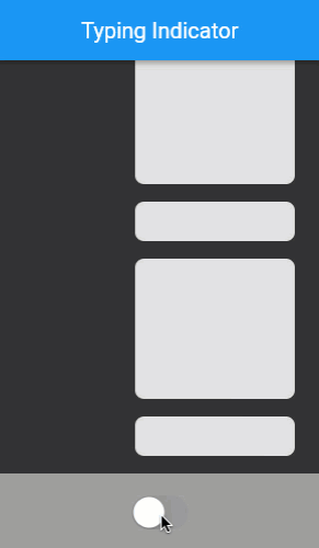
互動示例
#執行應用
- 點選螢幕底部的圓形開/關開關,以開啟和關閉打字指示器氣泡。
import 'dart:math';

import 'package:flutter/cupertino.dart';
import 'package:flutter/material.dart';

void main() {
  runApp(
    const MaterialApp(
      home: ExampleIsTyping(),
      debugShowCheckedModeBanner: false,
    ),
  );
}

const _backgroundColor = Color(0xFF333333);

class ExampleIsTyping extends StatefulWidget {
  const ExampleIsTyping({super.key});

  @override
  State<ExampleIsTyping> createState() => _ExampleIsTypingState();
}

class _ExampleIsTypingState extends State<ExampleIsTyping> {
  bool _isSomeoneTyping = false;

  @override
  Widget build(BuildContext context) {
    return Scaffold(
      backgroundColor: _backgroundColor,
      appBar: AppBar(title: const Text('Typing Indicator')),
      body: Column(
        children: [
          Expanded(
            child: ListView.builder(
              padding: const EdgeInsets.symmetric(vertical: 8),
              itemCount: 25,
              reverse: true,
              itemBuilder: (context, index) {
                return Padding(
                  padding: const EdgeInsets.only(left: 100),
                  child: FakeMessage(isBig: index.isOdd),
                );
              },
            ),
          ),
          Align(
            alignment: Alignment.bottomLeft,
            child: TypingIndicator(showIndicator: _isSomeoneTyping),
          ),
          Container(
            color: Colors.grey,
            padding: const EdgeInsets.all(16),
            child: Center(
              child: CupertinoSwitch(
                onChanged: (newValue) {
                  setState(() {
                    _isSomeoneTyping = newValue;
                  });
                },
                value: _isSomeoneTyping,
              ),
            ),
          ),
        ],
      ),
    );
  }
}

class TypingIndicator extends StatefulWidget {
  const TypingIndicator({
    super.key,
    this.showIndicator = false,
    this.bubbleColor = const Color(0xFF646b7f),
    this.flashingCircleDarkColor = const Color(0xFF333333),
    this.flashingCircleBrightColor = const Color(0xFFaec1dd),
  });

  final bool showIndicator;
  final Color bubbleColor;
  final Color flashingCircleDarkColor;
  final Color flashingCircleBrightColor;

  @override
  State<TypingIndicator> createState() => _TypingIndicatorState();
}

class _TypingIndicatorState extends State<TypingIndicator>
    with TickerProviderStateMixin {
  late AnimationController _appearanceController;

  late Animation<double> _indicatorSpaceAnimation;

  late Animation<double> _smallBubbleAnimation;
  late Animation<double> _mediumBubbleAnimation;
  late Animation<double> _largeBubbleAnimation;

  late AnimationController _repeatingController;
  final List<Interval> _dotIntervals = const [
    Interval(0.25, 0.8),
    Interval(0.35, 0.9),
    Interval(0.45, 1.0),
  ];

  @override
  void initState() {
    super.initState();

    _appearanceController = AnimationController(vsync: this)
      ..addListener(() {
        setState(() {});
      });

    _indicatorSpaceAnimation = CurvedAnimation(
      parent: _appearanceController,
      curve: const Interval(0.0, 0.4, curve: Curves.easeOut),
      reverseCurve: const Interval(0.0, 1.0, curve: Curves.easeOut),
    ).drive(Tween<double>(begin: 0.0, end: 60.0));

    _smallBubbleAnimation = CurvedAnimation(
      parent: _appearanceController,
      curve: const Interval(0.0, 0.5, curve: Curves.elasticOut),
      reverseCurve: const Interval(0.0, 0.3, curve: Curves.easeOut),
    );
    _mediumBubbleAnimation = CurvedAnimation(
      parent: _appearanceController,
      curve: const Interval(0.2, 0.7, curve: Curves.elasticOut),
      reverseCurve: const Interval(0.2, 0.6, curve: Curves.easeOut),
    );
    _largeBubbleAnimation = CurvedAnimation(
      parent: _appearanceController,
      curve: const Interval(0.3, 1.0, curve: Curves.elasticOut),
      reverseCurve: const Interval(0.5, 1.0, curve: Curves.easeOut),
    );

    _repeatingController = AnimationController(
      vsync: this,
      duration: const Duration(milliseconds: 1500),
    );

    if (widget.showIndicator) {
      _showIndicator();
    }
  }

  @override
  void didUpdateWidget(TypingIndicator oldWidget) {
    super.didUpdateWidget(oldWidget);

    if (widget.showIndicator != oldWidget.showIndicator) {
      if (widget.showIndicator) {
        _showIndicator();
      } else {
        _hideIndicator();
      }
    }
  }

  @override
  void dispose() {
    _appearanceController.dispose();
    _repeatingController.dispose();
    super.dispose();
  }

  void _showIndicator() {
    _appearanceController
      ..duration = const Duration(milliseconds: 750)
      ..forward();
    _repeatingController.repeat();
  }

  void _hideIndicator() {
    _appearanceController
      ..duration = const Duration(milliseconds: 150)
      ..reverse();
    _repeatingController.stop();
  }

  @override
  Widget build(BuildContext context) {
    return AnimatedBuilder(
      animation: _indicatorSpaceAnimation,
      builder: (context, child) {
        return SizedBox(height: _indicatorSpaceAnimation.value, child: child);
      },
      child: Stack(
        children: [
          AnimatedBubble(
            animation: _smallBubbleAnimation,
            left: 8,
            bottom: 8,
            bubble: CircleBubble(size: 8, bubbleColor: widget.bubbleColor),
          ),
          AnimatedBubble(
            animation: _mediumBubbleAnimation,
            left: 10,
            bottom: 10,
            bubble: CircleBubble(size: 16, bubbleColor: widget.bubbleColor),
          ),
          AnimatedBubble(
            animation: _largeBubbleAnimation,
            left: 12,
            bottom: 12,
            bubble: StatusBubble(
              repeatingController: _repeatingController,
              dotIntervals: _dotIntervals,
              flashingCircleDarkColor: widget.flashingCircleDarkColor,
              flashingCircleBrightColor: widget.flashingCircleBrightColor,
              bubbleColor: widget.bubbleColor,
            ),
          ),
        ],
      ),
    );
  }
}

class CircleBubble extends StatelessWidget {
  const CircleBubble({
    super.key,
    required this.size,
    required this.bubbleColor,
  });

  final double size;
  final Color bubbleColor;

  @override
  Widget build(BuildContext context) {
    return Container(
      width: size,
      height: size,
      decoration: BoxDecoration(shape: BoxShape.circle, color: bubbleColor),
    );
  }
}

class AnimatedBubble extends StatelessWidget {
  const AnimatedBubble({
    super.key,
    required this.animation,
    required this.left,
    required this.bottom,
    required this.bubble,
  });

  final Animation<double> animation;
  final double left;
  final double bottom;
  final Widget bubble;

  @override
  Widget build(BuildContext context) {
    return Positioned(
      left: left,
      bottom: bottom,
      child: AnimatedBuilder(
        animation: animation,
        builder: (context, child) {
          return Transform.scale(
            scale: animation.value,
            alignment: Alignment.bottomLeft,
            child: child,
          );
        },
        child: bubble,
      ),
    );
  }
}

class StatusBubble extends StatelessWidget {
  const StatusBubble({
    super.key,
    required this.repeatingController,
    required this.dotIntervals,
    required this.flashingCircleBrightColor,
    required this.flashingCircleDarkColor,
    required this.bubbleColor,
  });

  final AnimationController repeatingController;
  final List<Interval> dotIntervals;
  final Color flashingCircleDarkColor;
  final Color flashingCircleBrightColor;
  final Color bubbleColor;

  @override
  Widget build(BuildContext context) {
    return Container(
      width: 85,
      height: 44,
      padding: const EdgeInsets.symmetric(horizontal: 8),
      decoration: BoxDecoration(
        borderRadius: BorderRadius.circular(27),
        color: bubbleColor,
      ),
      child: Row(
        mainAxisAlignment: MainAxisAlignment.spaceEvenly,
        children: [
          FlashingCircle(
            index: 0,
            repeatingController: repeatingController,
            dotIntervals: dotIntervals,
            flashingCircleDarkColor: flashingCircleDarkColor,
            flashingCircleBrightColor: flashingCircleBrightColor,
          ),
          FlashingCircle(
            index: 1,
            repeatingController: repeatingController,
            dotIntervals: dotIntervals,
            flashingCircleDarkColor: flashingCircleDarkColor,
            flashingCircleBrightColor: flashingCircleBrightColor,
          ),
          FlashingCircle(
            index: 2,
            repeatingController: repeatingController,
            dotIntervals: dotIntervals,
            flashingCircleDarkColor: flashingCircleDarkColor,
            flashingCircleBrightColor: flashingCircleBrightColor,
          ),
        ],
      ),
    );
  }
}

class FlashingCircle extends StatelessWidget {
  const FlashingCircle({
    super.key,
    required this.index,
    required this.repeatingController,
    required this.dotIntervals,
    required this.flashingCircleBrightColor,
    required this.flashingCircleDarkColor,
  });

  final int index;
  final AnimationController repeatingController;
  final List<Interval> dotIntervals;
  final Color flashingCircleDarkColor;
  final Color flashingCircleBrightColor;

  @override
  Widget build(BuildContext context) {
    return AnimatedBuilder(
      animation: repeatingController,
      builder: (context, child) {
        final circleFlashPercent = dotIntervals[index].transform(
          repeatingController.value,
        );
        final circleColorPercent = sin(pi * circleFlashPercent);

        return Container(
          width: 12,
          height: 12,
          decoration: BoxDecoration(
            shape: BoxShape.circle,
            color: Color.lerp(
              flashingCircleDarkColor,
              flashingCircleBrightColor,
              circleColorPercent,
            ),
          ),
        );
      },
    );
  }
}

class FakeMessage extends StatelessWidget {
  const FakeMessage({super.key, required this.isBig});

  final bool isBig;

  @override
  Widget build(BuildContext context) {
    return Container(
      margin: const EdgeInsets.symmetric(vertical: 8, horizontal: 24),
      height: isBig ? 128 : 36,
      decoration: BoxDecoration(
        borderRadius: const BorderRadius.all(Radius.circular(8)),
        color: Colors.grey.shade300,
      ),
    );
  }
}