自動平臺適配
適配理念
#通常,存在兩種平臺自適應的情況
- 屬於作業系統環境行為(例如文字編輯和滾動)並且如果發生不同行為就會“出錯”的事項。
- 通常使用 OEM 的 SDK 在應用程式中實現的事項(例如在 iOS 上使用並行選項卡或在 Android 上顯示
android.app.AlertDialog)。
本文主要介紹 Flutter 在 Android 和 iOS 上為情況 1 提供的自動適配。
對於情況 2,Flutter 捆綁了產生平臺約定適當效果的方法,但在需要應用程式設計選擇時不會自動適配。有關討論,請參閱 問題 #8410 和 Material/Cupertino 自適應元件問題定義。
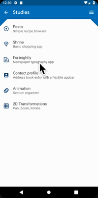
有關在 Android 和 iOS 上使用不同資訊架構結構但共享相同內容程式碼的應用程式示例,請參閱 platform_design 程式碼示例。
頁面導航
#Flutter 提供了 Android 和 iOS 上常見的導航模式,並自動將導航動畫適配到當前平臺。
導航過渡
#在 Android 上,預設的 Navigator.push() 過渡是根據 startActivity() 建模的,通常有一個自下而上的動畫變體。
在 iOS 上
- 預設的
Navigator.push()API 會根據區域設定的 RTL 設定,產生 iOS 顯示/推送樣式過渡,從結束到開始進行動畫。新路由後面的頁面也以與 iOS 相同的方向進行視差滑動。 - 當推送
PageRoute.fullscreenDialog為 true 的頁面路由時,存在單獨的自下而上的過渡樣式。這表示 iOS 的 Present/Modal 樣式過渡,通常用於全屏模態頁面。
特定平臺過渡詳情
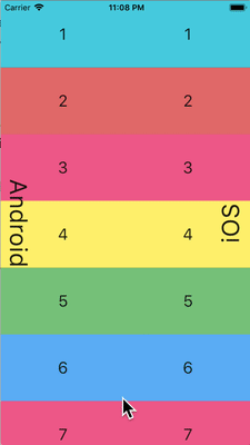
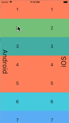
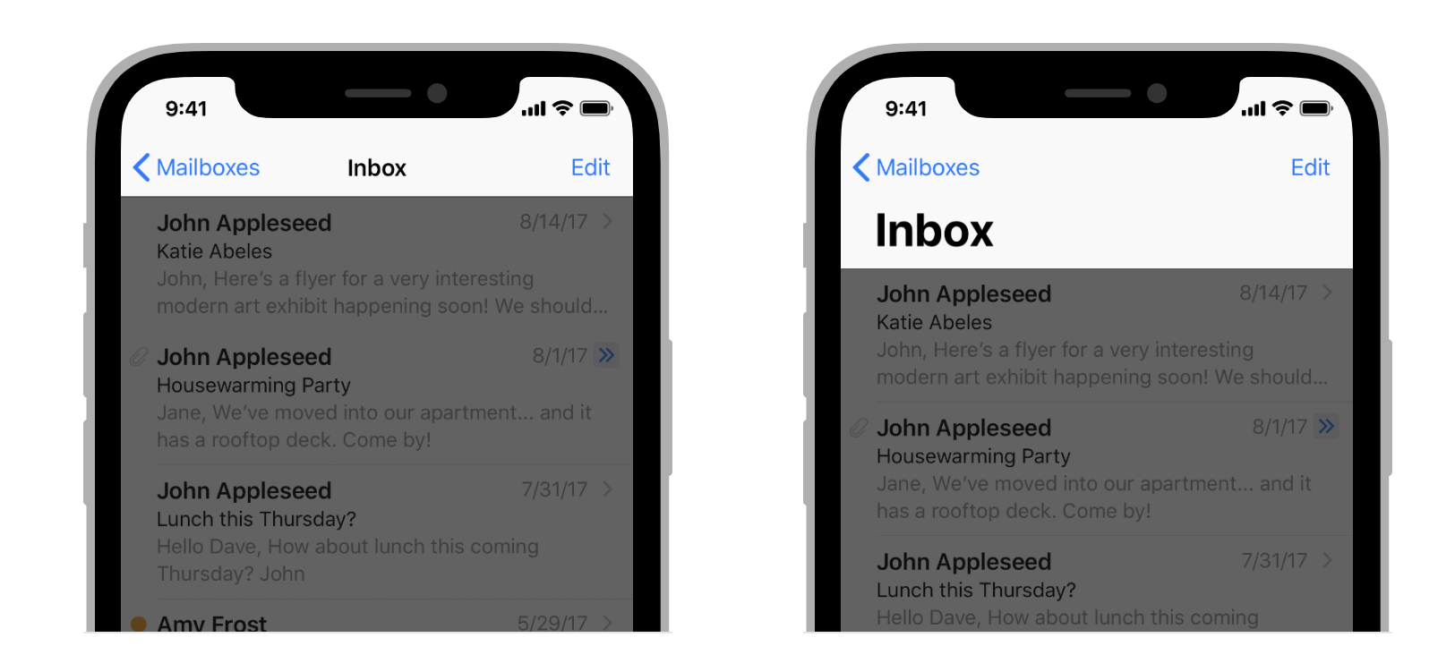
#在 Android 上,Flutter 使用 ZoomPageTransitionsBuilder 動畫。當用戶點選一個專案時,UI 會放大到顯示該專案的螢幕。當用戶點選返回時,UI 會縮小到上一個螢幕。
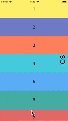
在 iOS 上,當使用推送樣式過渡時,Flutter 捆綁的 CupertinoNavigationBar 和 CupertinoSliverNavigationBar 導航欄會自動將每個子元件動畫到下一個或上一個頁面的 CupertinoNavigationBar 或 CupertinoSliverNavigationBar 上的相應子元件。

返回導航
#在 Android 上,作業系統返回按鈕預設傳送到 Flutter,並彈出 WidgetsApp 導航器中的頂部路由。
在 iOS 上,可以使用邊緣滑動手勢彈出頂部路由。
滾動
#滾動是平臺外觀和感覺的重要組成部分,Flutter 會自動調整滾動行為以匹配當前平臺。
物理模擬
#Android 和 iOS 都有複雜的滾動物理模擬,難以用語言描述。通常,iOS 的可滾動物件具有更大的重量和動態摩擦力,而 Android 具有更大的靜態摩擦力。因此,iOS 逐漸獲得高速但停止得不那麼突然,並且在低速時更滑。

過度滾動行為
#在 Android 上,滾動超出可滾動區域的邊緣會顯示 過度滾動發光指示器(根據當前 Material 主題的顏色)。
在 iOS 上,滾動超出可滾動區域的邊緣會以增加的阻力 過度滾動 並彈回。
動量
#在 iOS 上,朝同一方向重複輕彈會堆疊動量並隨著每次連續輕彈而獲得更高的速度。Android 上沒有等效的行為。
返回頂部
#在 iOS 上,點選作業系統狀態列會將主要滾動控制器滾動到頂部位置。Android 上沒有等效的行為。
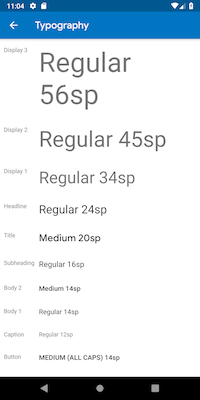
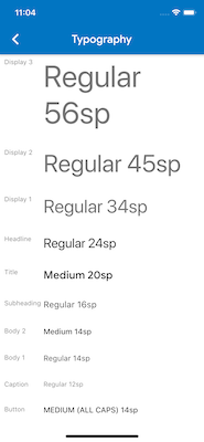
排版
#使用 Material 包時,排版會自動預設為適合平臺的字體系列。Android 使用 Roboto 字型。iOS 使用 San Francisco 字型。
使用 Cupertino 包時,預設主題 使用 San Francisco 字型。
San Francisco 字型許可證限制其僅用於在 iOS、macOS 或 tvOS 上執行的軟體。因此,如果平臺被除錯覆蓋為 iOS 或使用預設 Cupertino 主題,則在 Android 上執行時會使用備用字型。
您可能會選擇調整 Material 元件的文字樣式以匹配 iOS 上的預設文字樣式。您可以在UI 元件部分中檢視特定元件的示例。
圖示
#使用 Material 包時,某些圖示會自動根據平臺顯示不同的圖形。例如,溢位按鈕的三個點在 iOS 上是水平的,在 Android 上是垂直的。返回按鈕在 iOS 上是一個簡單的 V 形,在 Android 上帶有一個杆/軸。


Material 庫還透過 Icons.adaptive 提供了一組平臺自適應圖示。
觸覺反饋
#Material 和 Cupertino 包在某些情況下會自動觸發平臺適當的觸覺反饋。
例如,透過文字欄位長按選擇單詞會在 Android 上觸發“嗡嗡”震動,而在 iOS 上則不會。
在 iOS 上滾動選擇器專案會觸發“輕微撞擊”敲擊,而在 Android 上則沒有反饋。
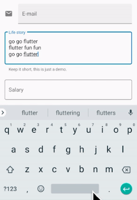
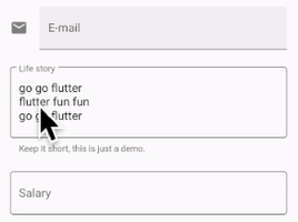
文字編輯
#Material 和 Cupertino 文字輸入欄位都支援拼寫檢查,並適配使用適當的平臺拼寫檢查配置以及適當的拼寫檢查選單和高亮顏色。
Flutter 還在編輯文字欄位內容時進行以下適配以匹配當前平臺。
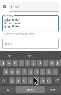
鍵盤手勢導航
#在 Android 上,可以在軟鍵盤的 空格 鍵上進行水平滑動,以在 Material 和 Cupertino 文字欄位中移動游標。
在具有 3D Touch 功能的 iOS 裝置上,可以在軟鍵盤上進行強制按壓拖動手勢,以透過浮動游標在 2D 中移動游標。這在 Material 和 Cupertino 文字欄位中都有效。
文字選擇工具欄
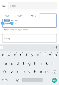
#使用 Material on Android 時,在文字欄位中進行文字選擇時會顯示 Android 樣式選擇工具欄。
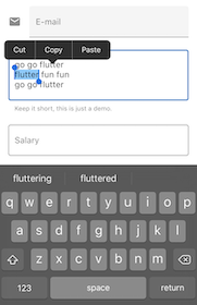
使用 Material on iOS 或使用 Cupertino 時,在文字欄位中進行文字選擇時會顯示 iOS 樣式選擇工具欄。
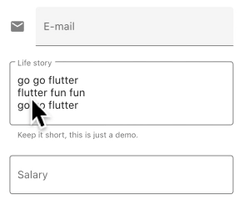
單次點選手勢
#使用 Material on Android 時,在文字欄位中進行單次點選會將游標置於點選位置。
摺疊的文字選擇還會顯示一個可拖動手柄以隨後移動游標。
使用 Material on iOS 或使用 Cupertino 時,在文字欄位中進行單次點選會將游標置於所點選單詞的最近邊緣。
摺疊的文字選擇在 iOS 上沒有可拖動手柄。
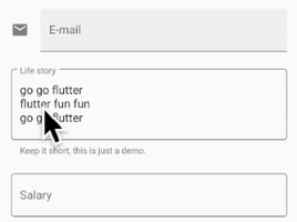
長按手勢
#使用 Material on Android 時,長按會選擇長按下的單詞。釋放後顯示選擇工具欄。
使用 Material on iOS 或使用 Cupertino 時,長按會將游標置於長按位置。釋放後顯示選擇工具欄。
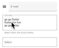
長按拖動手勢
#使用 Material on Android 時,在按住長按的同時拖動會展開選定的單詞。
使用 Material on iOS 或使用 Cupertino 時,在按住長按的同時拖動會移動游標。
雙擊手勢
#在 Android 和 iOS 上,雙擊都會選擇接收雙擊的單詞並顯示選擇工具欄。
UI 元件
#本節包含關於如何適配 Material 元件以在 iOS 上提供自然引人入勝的體驗的初步建議。歡迎您在 問題 #8427 上提供反饋。
帶有 .adaptive() 建構函式的元件
#多個元件支援 .adaptive() 建構函式。下表列出了這些元件。當應用程式在 iOS 裝置上執行時,自適應建構函式會替換相應的 Cupertino 元件。
下表中的元件主要用於輸入、選擇和顯示系統資訊。由於這些控制元件與作業系統緊密整合,使用者已經習慣了識別和響應它們。因此,我們建議您遵循平臺約定。
| Material 元件 | Cupertino 元件 | 自適應建構函式 |
|---|---|---|
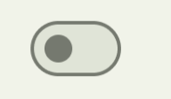 Switch |  CupertinoSwitch | Switch.adaptive() |
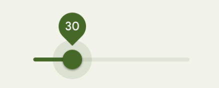 Slider | 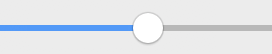 CupertinoSlider | Slider.adaptive() |
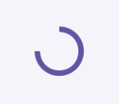 CircularProgressIndicator |  CupertinoActivityIndicator | CircularProgressIndicator.adaptive() |
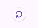 RefreshProgressIndicator |  CupertinoActivityIndicator | RefreshIndicator.adaptive() |
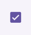 Checkbox |  CupertinoCheckbox | Checkbox.adaptive() |
 Radio |  CupertinoRadio | Radio.adaptive() |
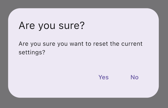 AlertDialog | 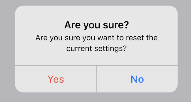 CupertinoAlertDialog | AlertDialog.adaptive() |
頂部應用欄和導航欄
#自 Android 12 起,頂部應用欄的預設 UI 遵循 Material 3 中定義的設計指南。在 iOS 上,Apple 的人機介面指南 (HIG) 中定義了一個名為“導航欄”的等效元件。
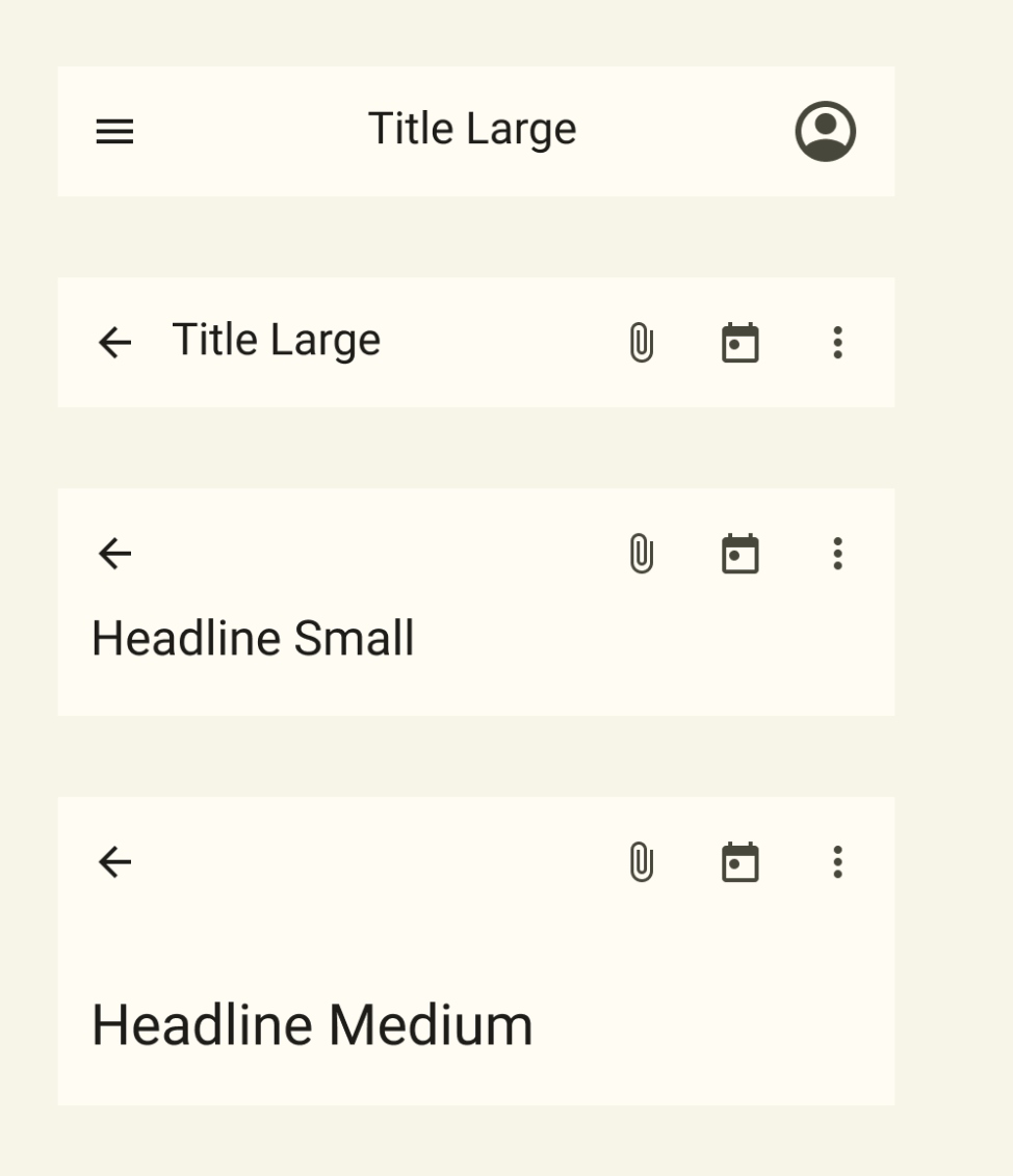
Flutter 應用程式中應用欄的某些屬性應進行適配,例如系統圖標和頁面過渡。這些在使用 Material AppBar 和 SliverAppBar 元件時已經自動適配。您還可以進一步自定義這些元件的屬性,以更好地匹配 iOS 平臺樣式,如下所示。
// Map the text theme to iOS styles
TextTheme cupertinoTextTheme = TextTheme(
    headlineMedium: CupertinoThemeData()
        .textTheme
        .navLargeTitleTextStyle
         // fixes a small bug with spacing
        .copyWith(letterSpacing: -1.5),
    titleLarge: CupertinoThemeData().textTheme.navTitleTextStyle)
...

// Use iOS text theme on iOS devices
ThemeData(
      textTheme: Platform.isIOS ? cupertinoTextTheme : null,
      ...
)
...

// Modify AppBar properties
AppBar(
        surfaceTintColor: Platform.isIOS ? Colors.transparent : null,
        shadowColor: Platform.isIOS ? CupertinoColors.darkBackgroundGray : null,
        scrolledUnderElevation: Platform.isIOS ? .1 : null,
        toolbarHeight: Platform.isIOS ? 44 : null,
        ...
),但是,由於應用欄與頁面中的其他內容一起顯示,因此建議僅在與應用程式其他部分保持一致的情況下調整樣式。您可以在GitHub 上關於應用欄適配的討論中檢視更多程式碼示例和進一步的解釋。
底部導航欄
#自 Android 12 起,底部導航欄的預設 UI 遵循 Material 3 中定義的設計指南。在 iOS 上,Apple 的人機介面指南 (HIG) 中定義了一個名為“標籤欄”的等效元件。
由於標籤欄在您的應用程式中是持久的,因此它們應與您自己的品牌相匹配。但是,如果您選擇在 Android 上使用 Material 的預設樣式,您可能會考慮適配到預設的 iOS 標籤欄。
要實現特定於平臺的底部導航欄,您可以在 Android 上使用 Flutter 的 NavigationBar 元件,在 iOS 上使用 CupertinoTabBar 元件。下面是一個程式碼片段,您可以對其進行適配以顯示特定於平臺的導航欄。
final Map<String, Icon> _navigationItems = {
'Menu': Platform.isIOS ? Icon(CupertinoIcons.house_fill) : Icon(Icons.home),
'Order': Icon(Icons.adaptive.share),
};
...
Scaffold(
body: _currentWidget,
bottomNavigationBar: Platform.isIOS
? CupertinoTabBar(
currentIndex: _currentIndex,
onTap: (index) {
setState(() => _currentIndex = index);
_loadScreen();
},
items: _navigationItems.entries
.map<BottomNavigationBarItem>(
(entry) => BottomNavigationBarItem(
icon: entry.value,
label: entry.key,
))
.toList(),
)
: NavigationBar(
selectedIndex: _currentIndex,
onDestinationSelected: (index) {
setState(() => _currentIndex = index);
_loadScreen();
},
destinations: _navigationItems.entries
.map<Widget>((entry) => NavigationDestination(
icon: entry.value,
label: entry.key,
))
.toList(),
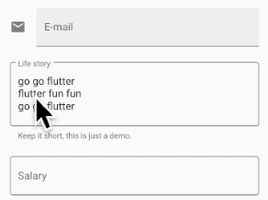
));文字欄位
#自 Android 12 起,文字欄位遵循 Material 3 (M3) 設計指南。在 iOS 上,Apple 的 人機介面指南 (HIG) 定義了一個等效元件。
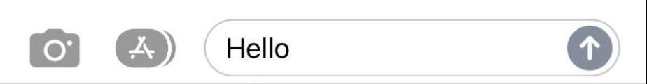
由於文字欄位需要使用者輸入,
其設計應遵循平臺約定。
要在 Flutter 中實現特定於平臺的 TextField,您可以調整 Material TextField 的樣式。
Widget _createAdaptiveTextField() {
  final _border = OutlineInputBorder(
    borderSide: BorderSide(color: CupertinoColors.lightBackgroundGray),
  );

  final iOSDecoration = InputDecoration(
    border: _border,
    enabledBorder: _border,
    focusedBorder: _border,
    filled: true,
    fillColor: CupertinoColors.white,
    hoverColor: CupertinoColors.white,
    contentPadding: EdgeInsets.fromLTRB(10, 0, 0, 0),
  );

  return Platform.isIOS
      ? SizedBox(
          height: 36.0,
          child: TextField(
            decoration: iOSDecoration,
          ),
        )
      : TextField();
}
要了解有關文字欄位適配的更多資訊,請檢視 GitHub 上關於文字欄位的討論。您可以在討論中留下反饋或提出問題。